suecrook513802eyv
Level 1 course for BA Photography Degree
express your vision
open college of the arts
Exercise 4.1
Take a pic of a dark tone, middle tone and light tone - compare them with quick sketches of the histograms

This was a dark navy coat tone taken on a fully automatic setting
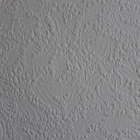
This was a pale cream coloured wall paper taken on a fully automatic setting

This was a white plastic bag taken on a fully automatic setting
Im not sure if this was supposed to happen but the tones almost came out identical in all three pics, even though it was a dark navy tone through to a bright white tone. The camera has over compensated for the different tones in the fully automatic mode.
I will now try the same test in manual mode and see what the results are?

In manual mode the camera has just accepted what I told it to do and not tried to adjust it, there are more dark tones in this pic
The mid tone is quite similar to the above one as it is easier to judge

The whites are whiter

Exercise 4.2

These are images of the same tree taken at early morning, afternoon, evening and night
The sun was barely out early morning so the tree looks flatter
The mid-day shot has lots of bright light above the tree and shadow underneath, it makes it look 3 dimensional.
The evening shot has lovely lighting, the ground has depth and the tree really pops out of the scene.
The night shot would have been quite bland and you wouldnt have been able to see it, but someone had set fire to the mountain and the fire is behind the tree, so again it really pops out of the scene and looks quite dramatic.
Exercise 4.3
...the beauty of artificial light

Even though this light wasnt artificial, it was very dark and covered by a coloured roof so the sculpture was toned to an almost green hue.

The same sculpture phtographed against a bright window, still had an almost green hue to it due to the coloured roof panels.

The same window only this time taken from outside looking into the sculptures. The sculpture on the outside was made of aluminium and the camera/sun over exposed the image.
The images above really fight against the green panels and the camera tried to over compensate. even though the exercise asked you to use artificial light the green panels did the same job here as it fooled the camera into thinking it was an artificial light source and then darker light from inside and bright light from the window. The images became grainy through having to use a high ISO. Compared to the natural light of the previous exercise the quality of these images are not very good. You could correct this by using a tripod and longer shutter speed or an off camera flash to fill in the sunject from the side/front.
Exercise 4.4

I chose Henry Moore sculptures because I have a sculpture I did myself when I was doing A Levels and wanted to photograph it for ages, not that I am anywhere near Mr Moores standard, but it is an interesting shape to photograph.
Creativity Criteria reminder – Imagination, Experimentation and Invention.
Most of the lighting is typical standard photographic studio lighting. I am looking for unusual lighting techniques for this exercise to make it different.
I particularly like the white object against white background.


Types of lighting I would like to try-
Multiple exposure, different coloured lights, black and white, minimum light such as candle, shooting light through net so pattern reflects on sculpture, white on white, white on black.
My images differ because I am not looking at them from a commercial/selling the images in a catalogue type of way. I am shooting them in an exploring light kind of way.
Bill Brandts imagery is quite stark in contrast.
He quoted – Photography is not a sport. It has no rules. Everything must be dared and tried!
Bill Brandt -
Read more: http://www.photoquotes.com/showquotes.aspx?id=259&name=Brandt,Bill#ixzz3ipCMDJCW
Exercise 4.5
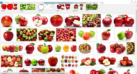
This is a straightforward screen snatch off Google on the image 'apple'.


The top two are straight forward images of apples, one done in colour the other in b+w. The bottom image has been shot (badly) against a white background, but more in the image of the ones above, but i have concentrated more on the water beeding on the last shot.

This shot of a wrinkled pepper is one of my favourite images as the colour is intensified against a b+w background. I was taking photos of the pepper at its best to all the way through to it being decayed. If I had had more time i would have done the same with an apple to show the different stages and used this as a time lapse study.